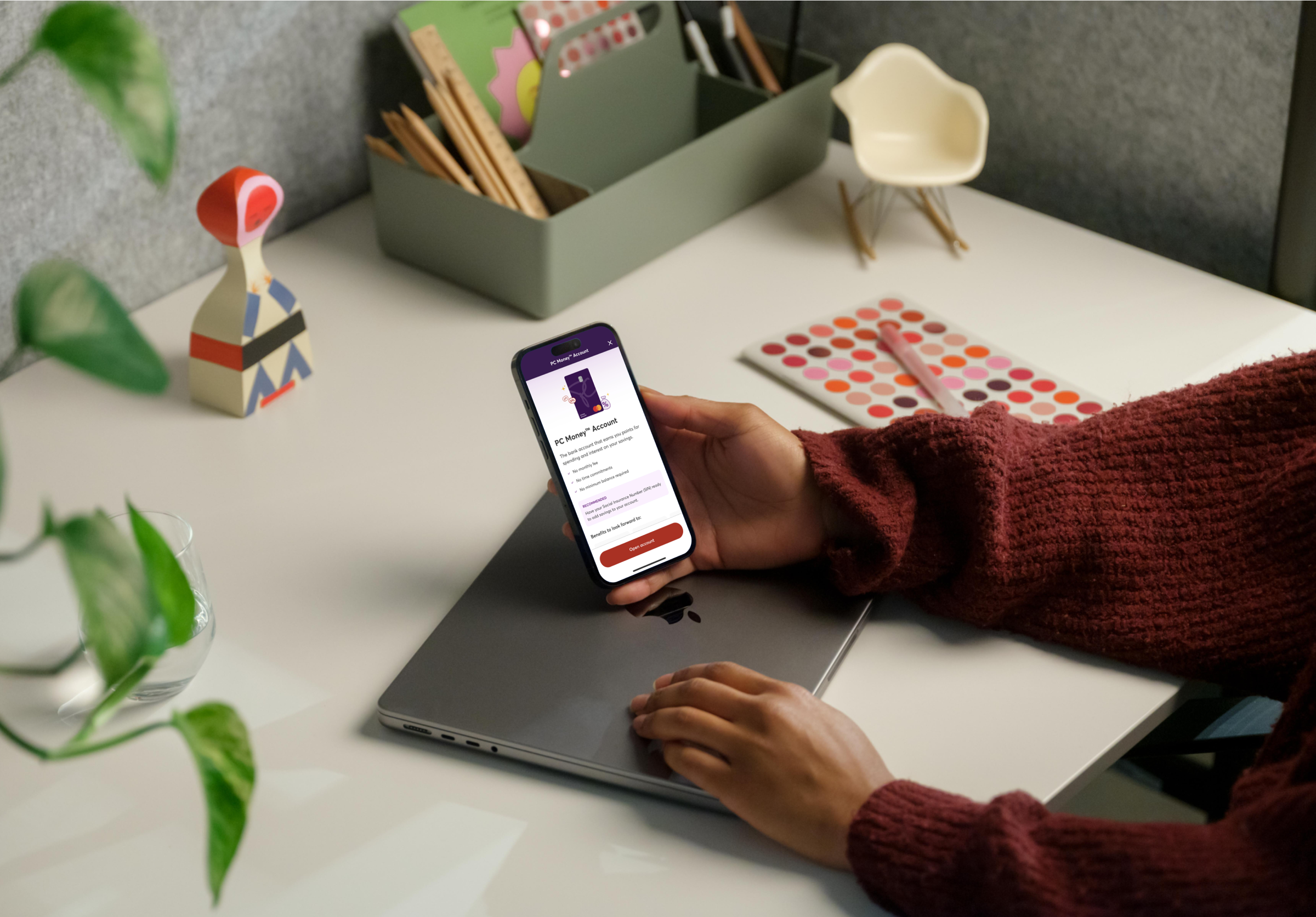
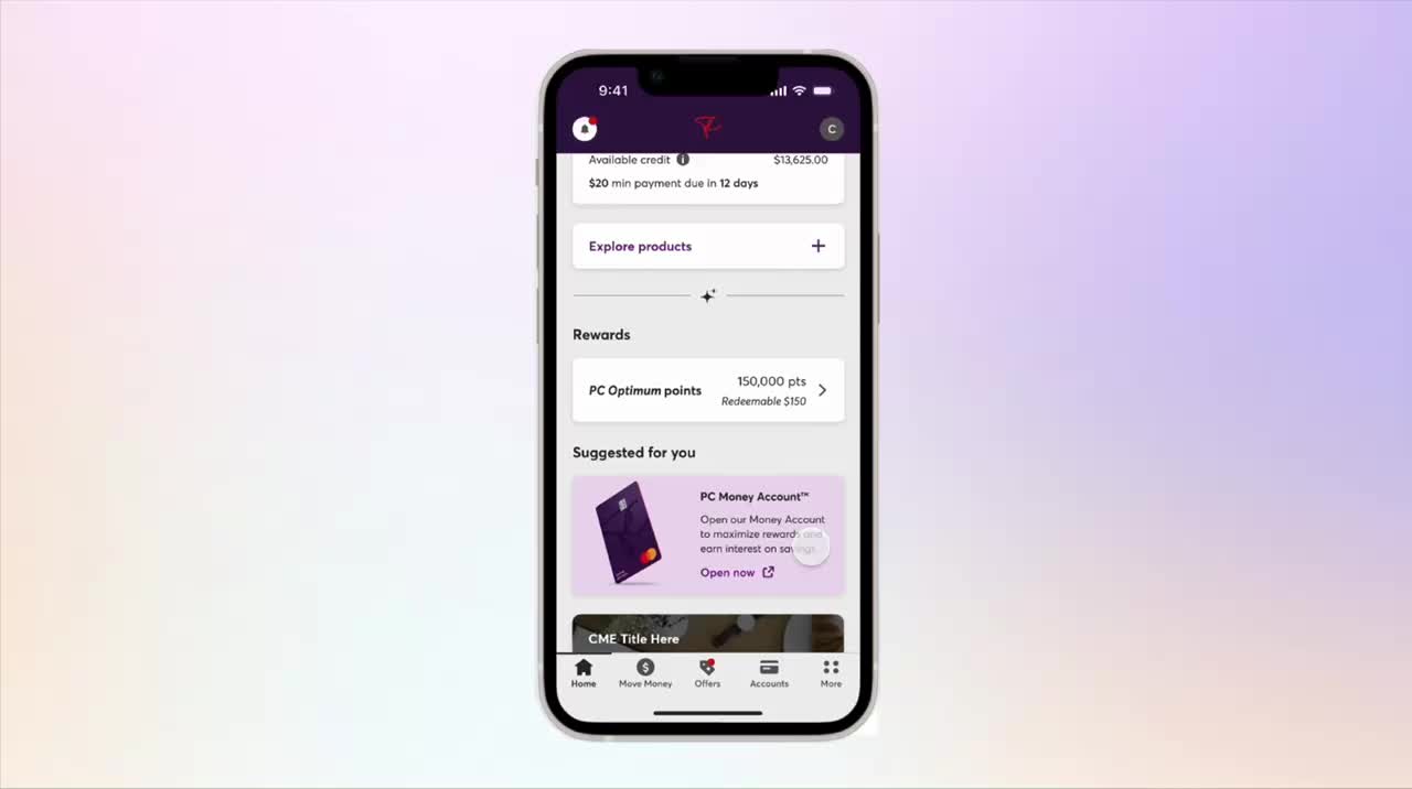
Bringing the PC Money Account application into the banking app for a seamless cross-sell experience
OVERVIEW
As an existing credit card client, the journey to apply for PC Money Account is disjointed. We want to make the application easier by moving the product application journey right into the banking app so applying for a product will be quicker and simpler for a higher conversion rate.
This project was initiated by my product manager and me. We saw a low-hanging fruit and decided to take the leap!
This project was initiated by my product manager and me. We saw a low-hanging fruit and decided to take the leap!
April - May 2025
In testing
Product Designer (me!)
Product Manager
Technical Product Owner
Engineering team
Product Manager
Technical Product Owner
Engineering team
PROBLEM
As an existing PC Mastercard client, the experience of applying for PC Money Account feels bumpy and disjointed
We receive about 50,000 clicks on the cross-sell presentments per month, but only a fraction of this is converted to real applications. Through user interviews, we found that but 8/10 of users also feel discouraged by external links.

The first friction point is that the users are forced to exit the app
If users open the link, users still don’t get to learn more about the product. They instead are prompted to re-login and apply directly.
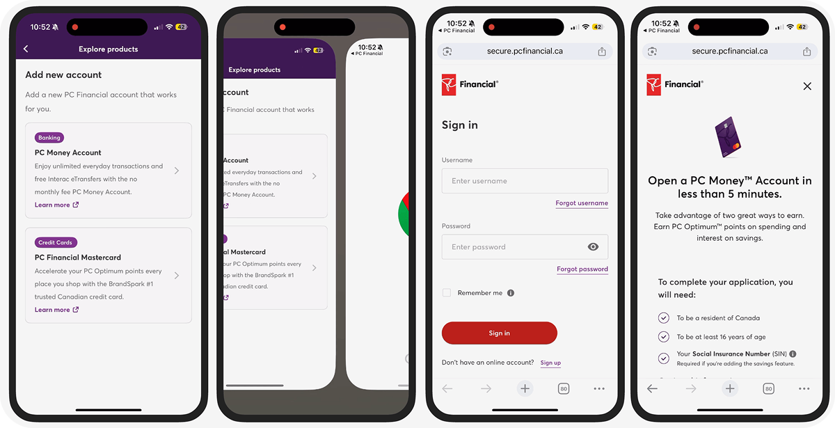
The current application process for an existing client
Despite the pre-filled form by the system, users still need to go through the application steps one-by-one, causing low click-through rate.

Major drop-off points during application flow
During the application process, the application flow still results in a high drop-off rate despite having the information pre-filled by the system.
The experience is not mobile optimized
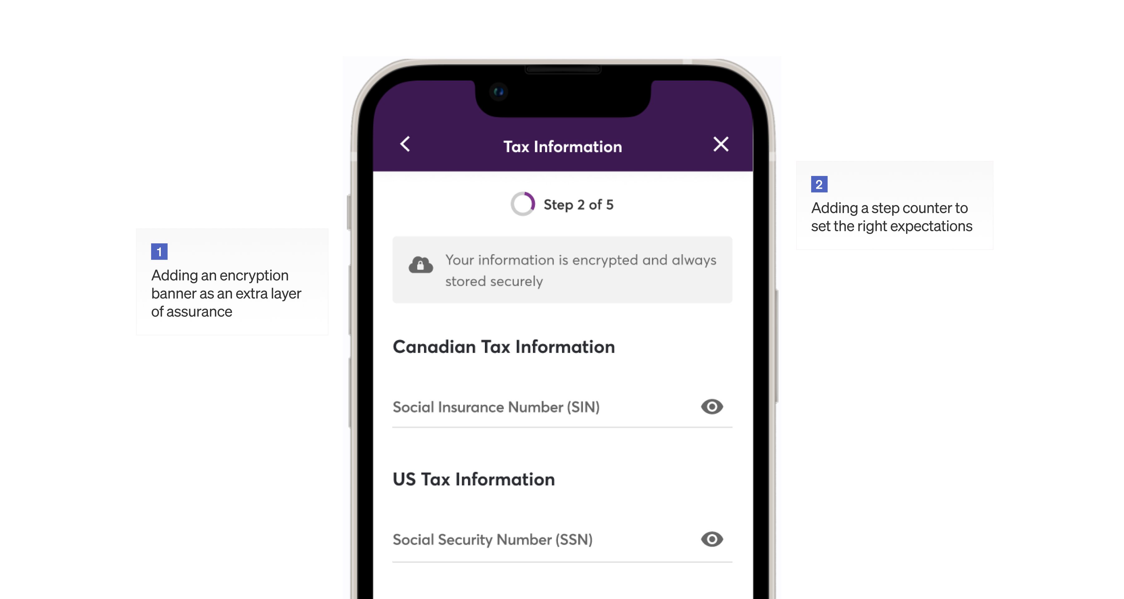
The entire application process is very text-heavy which leads to visual clutters, like the tax info section.
Lengthy steps result in a long submission time
Questions like employment address and contact cause application abandonment. Not only that these information are not necessary, they are also difficult for the users to retrieve.
Slow loading time during submission
More steps require more validations, which increases latency and loading time at submission.
Findings
We saw drop-off because we frustrate users with an application experience that's confusing, lengthy, and not mobile-optimized
HMW
How might we remove frictions to ensure the cross-sell and application experience is smooth, fast, and simple?
DESIGN PRINCIPLES
Optimize for mobile with minimal and transparent design
Mobile-optimized
80% of our banking access and application submissions come from mobile visits, so it is essential that we design with mobile design principles in mind.
Minimal
Users are on the banking app to perform tasks related to their finances, so it is imperative that we reduce the amount of steps as much to reduce the risk of abandonment.
Transparent
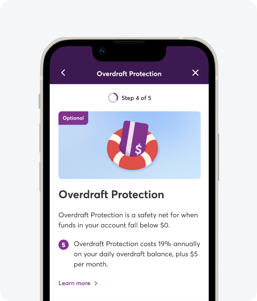
Product applications ask users for their sensitive information. Users always need to be aware of why we ask for these information and why certain steps are required.
KPIs
What success looks like
Can users understand and feel confident about the product without having to learn about it on PC Financial's website?
Click rate and bounce rate
Drop-off rate and locations
Application completion time
Application submission rate
Application submission rate
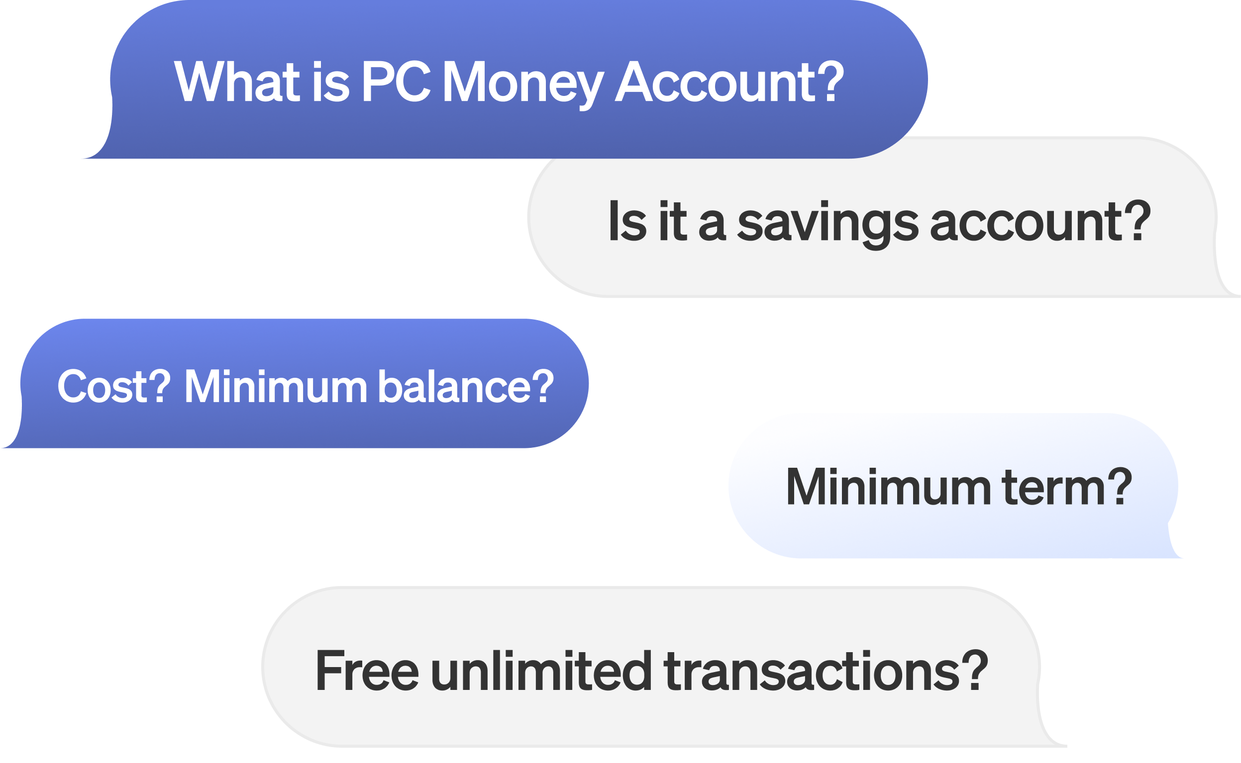
How do we best educate users about PC Money Account in one concise screen?
Users will need to learn about PC Money Account, without having to go through PCFinancial.ca. From user interviews, we found 5 major info that users make or break users' decision when it comes to banking accounts.
Autofill, remove, shorten, and reform the application process
I collaborated closely with the engineering team to overhaul the end-to-end flow by removing unnecessary steps and boil down lengthy multi-pages steps into fewer pre-filled pages.

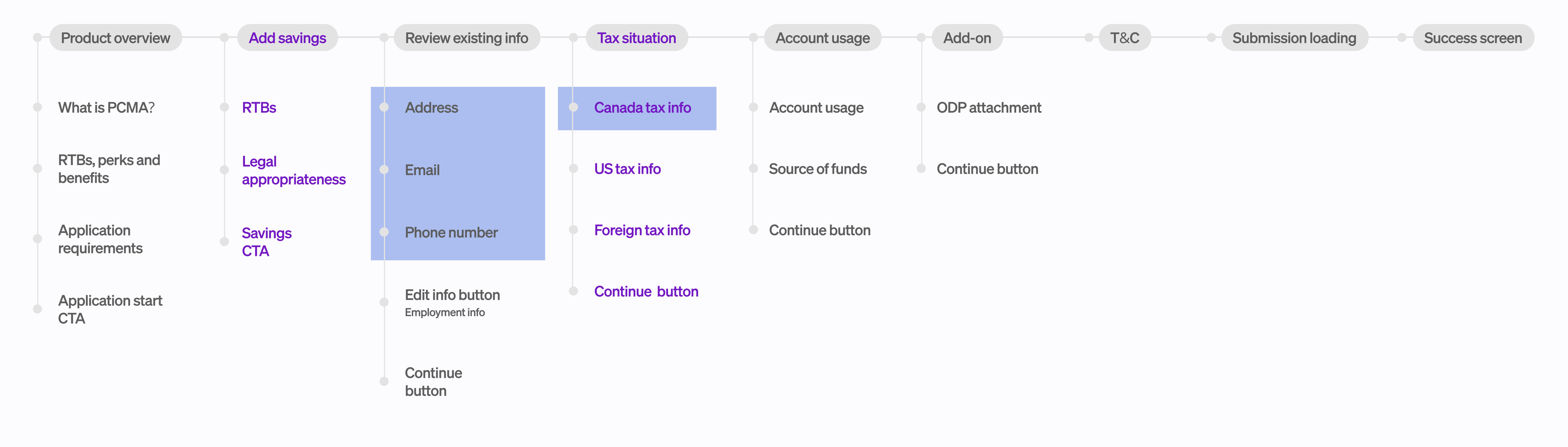
Iterating for content design, overlapping initiatives, and scalability
After reviewing the first iteration of the design, below are the feedback and challenges I had to iterate on:


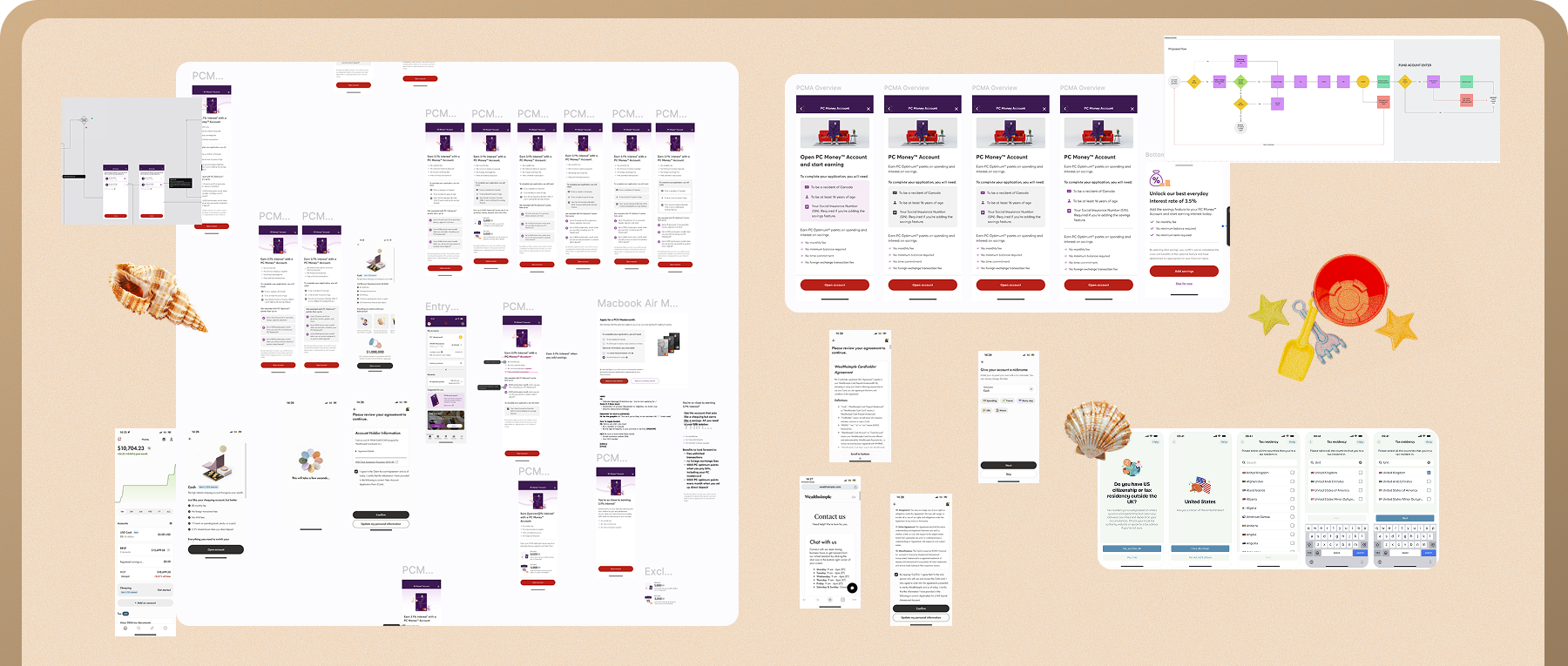
Design Sandbox
Messy design processes, explorations, and research.
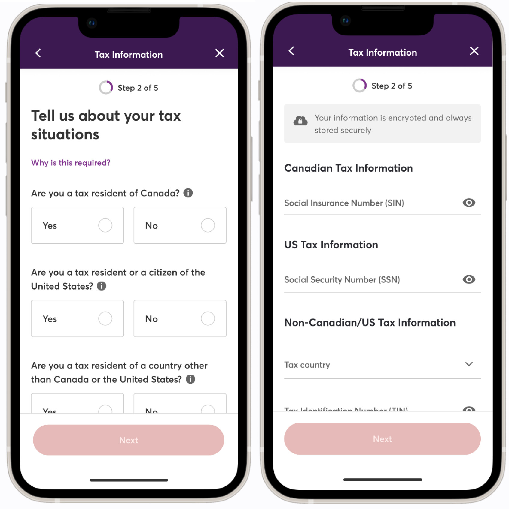
final design
The new in-app PC Money Account product application journey
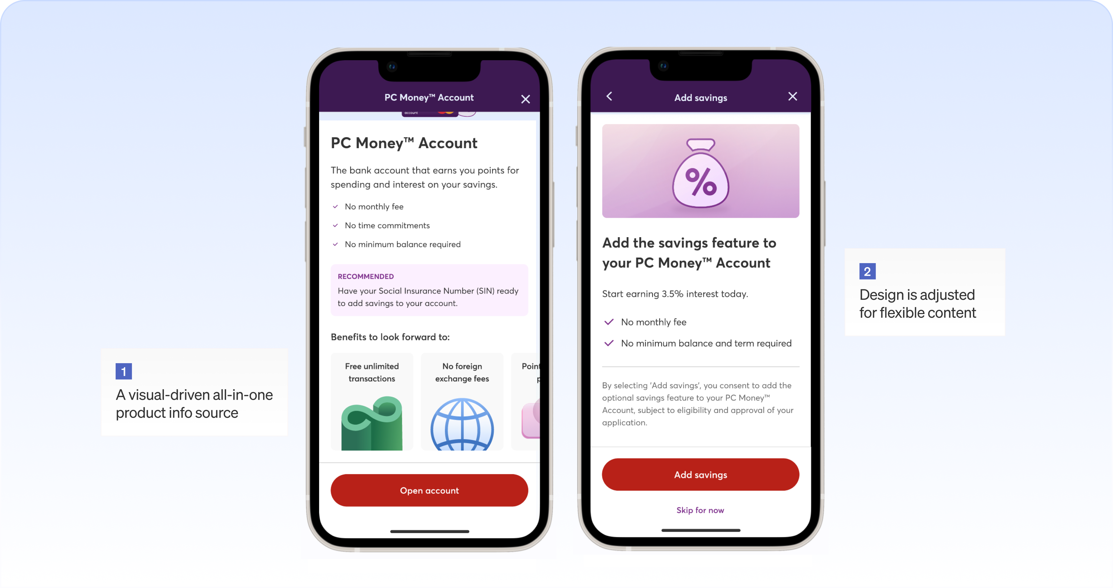
Designed for performance
This design allows for shorter loading time during submission to further reduce drop-off.
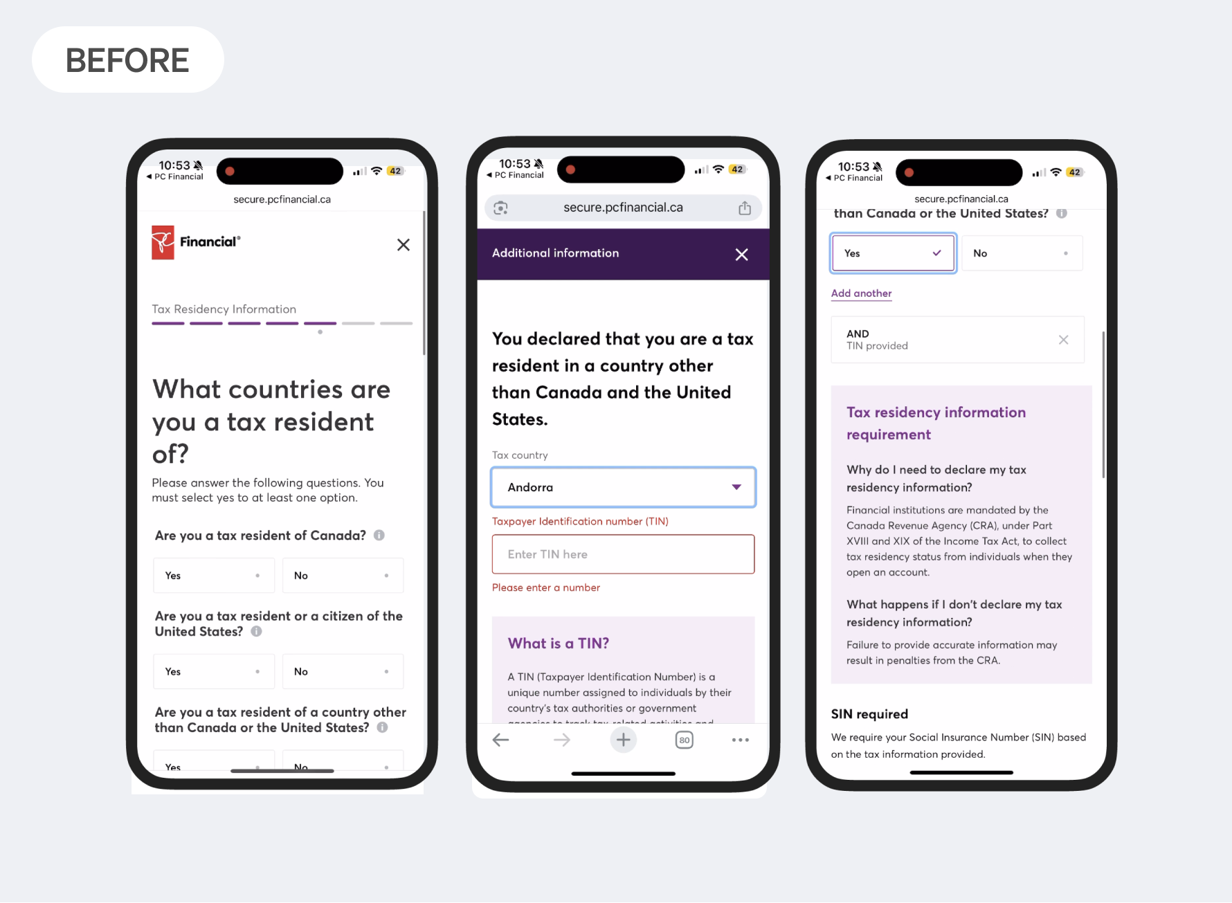
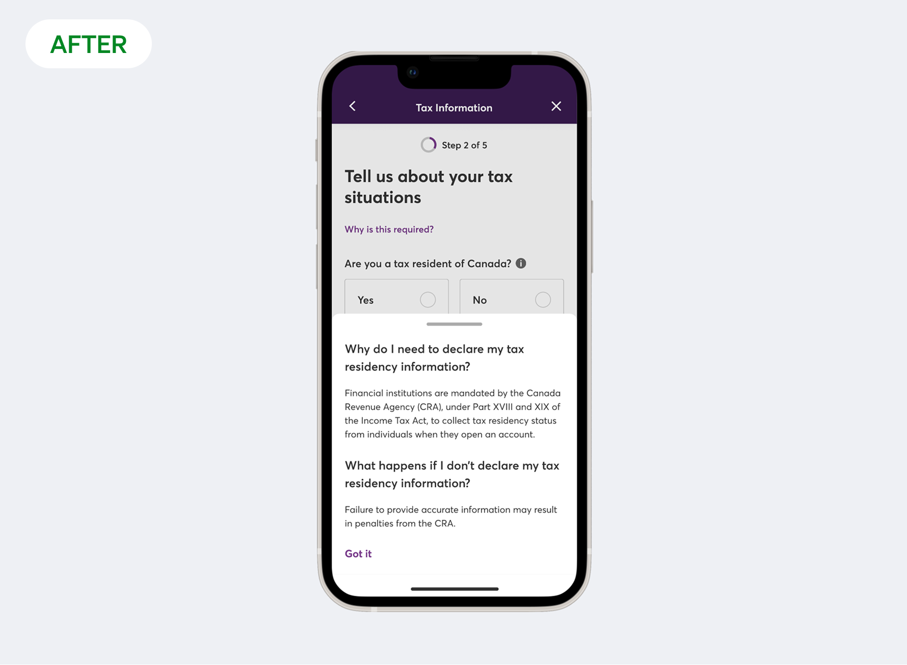
BEFORE AND AFTER
Improving lightness and clarity by cutting down the number of steps needed


Tucking away written explanations but keeping it within users' reach
outcome
Hitting the key KPIs
8/10 user testing participants claim that they feel confident to apply for the product from the in-app product info page
A reduced drop-off rate from 8.1% to 1.4% during application
Application completion and submission rate increased by 10%
what's next?